/Oakwrights%20Brand%20Design/Case%20Study%20-%20Oakwrights%20Brand%20Design%20-%20Image%201.png?width=1170&height=529&name=Case%20Study%20-%20Oakwrights%20Brand%20Design%20-%20Image%201.png)
Oakwrights does phenomenal work – its beautiful oak framed buildings are some of the UK’s most popular for good reason – but it wasn’t showing the best of itself to new audiences. With the digitalisation of business and the workplace, Oakwrights wanted to be at the forefront of its craft, continuing to invest in R&D, product knowledge and technology, all while retaining its unique offering in traditional, bespoke oak frames. To do it all, the company needed a total rebrand.
/Oakwrights%20Brand%20Design/Case%20Study%20-%20Oakwrights%20Brand%20Design%20-%20Image%202.png?width=1440&height=648&name=Case%20Study%20-%20Oakwrights%20Brand%20Design%20-%20Image%202.png)
/Oakwrights%20Brand%20Design/Oakwrights_Brochure_Mockup_Post_570x360%20copy.jpg?width=570&height=360&name=Oakwrights_Brochure_Mockup_Post_570x360%20copy.jpg)

We started by getting to know the market Oakwrights sits in and found that it had become more challenging in recent years. Oakwrights is a premium brand that offers a premium experience, so this rebrand needed to make it stand out for its luxury credentials. First, we overhauled its dated colour scheme to create something that felt fresh, with just a hint of opulence.
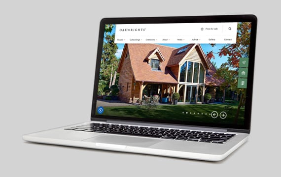
Then we turned our attention to everything from typography through to layout and the smallest design details across the brand’s digital output. It was the website where the Oakwrights team wanted to see the greatest change, so we streamlined all branding there, creating a look and feel that’s refined yet impactful.
/Oakwrights%20Brand%20Design/Case%20Study%20-%20Oakwrights%20Brand%20Design%20-%20Image%205.png?width=570&height=360&name=Case%20Study%20-%20Oakwrights%20Brand%20Design%20-%20Image%205.png)
/Oakwrights%20Brand%20Design/Case%20Study%20-%20Oakwrights%20Brand%20Design%20-%20Image%206.png?width=570&height=360&name=Case%20Study%20-%20Oakwrights%20Brand%20Design%20-%20Image%206.png)
Our design and digital teams collaborated, ensuring each element worked well for print and digital and we thought a lot about end users too. There was no point going only halfway with the project, so we made sure the rebrand was seen across all marketing, wherever it sat. That way, customers see the same, single, beautiful brand everywhere they look. So do you.
DRPG is part of DRP Holdings Limited, legally trading as DRPG, a company registered in England and Wales Company Number 04519180.
Registered Office being: Unit 212 Ikon Estate, Droitwich Road, Hartlebury, Worcestershire, DY10 4EU
© 2025 DRPG. All rights reserved