“When UX doesn’t consider ALL users, shouldn’t it be known as “SOME User Experience” or… SUX?”
— Billy Gregory, Senior Accessibility Engineer
Tommy Mason is a Freelance Designer under the studio name ‘Scamp Studio’. He’s been designing for just over eight years focusing primarily on digital design including UX/UI for apps and websites as well as brand work. He works hard to guide his clients towards creating accessibility driven solutions that are more innovative and help them move beyond the norm of only improving current solutions, or in his words: “Being a little more Netflix and a little less Blockbuster.”
 Tommy spoke at the first Flux Meetup event held at DRPG in October, where he discussed the importance of accessibility in design and considering diversity and inclusivity in UX. Here we talk to him about what inspired his focus, the importance of designing for accessibility and top tips for those looking to make their designs a little more diversity friendly.
What is digital accessibility?
Within the design world and the dreaded ‘Design Twitter’ we creatives sometimes fall into the trap of designing things for other designers to appreciate, focussing on the aesthetic rather than designing things that actually work for people. Digital accessibility is not just about website functionality or designing for a single person but designing digital solutions for everyone and being inclusive so that what you create can be accessed and used by all. This can be addressed in the design workflow by using tools and practices throughout the process and even within the development stage.
What inspired you to focus on accessibility primarily?
My passion for accessibility was inspired years ago by my younger brother who suffers from dyslexia. One of the first apps I designed was to help him text easier. At school, he uses a coloured filter card to place over his textbooks to make the text more legible for him, but when it came to texting our mum he struggled with the screen. So I designed an app for his phone that allowed him to use the equivalent to his coloured card, on his phone.
Why is it important to consider accessibility in UX design?
1 in 5 of the UK population suffer from a disability, and only 1 in 3 of those disabilities are obvious. A user’s needs aren’t always apparent so it’s important to ensure you’re being inclusive and diverse within your products.
If you’re not creating products that are accessible for all, then why are you designing in the first place? People like design that considers people. Accessibility considerations are not just for people with impairments. Chances are you’ve experienced inaccessibility in one form or another even if you don’t have a disability. Accessibility is made up of the qualities that make an experience open to all.
What is involved?
Mainly empathy and being a considerate person. It’s really not hard, but unfortunately, designers fall into the trap of designing things for websites like Dribbble (a designer portfolio platform) instead of for people. Throughout the design process, designers can assess and test their designs and check their Web Content Accessibility Guidelines (WCAG) compliancy with the use of tools such as Stark and Maze. For those unfamiliar with these tools, here are their basic functions:
Stark
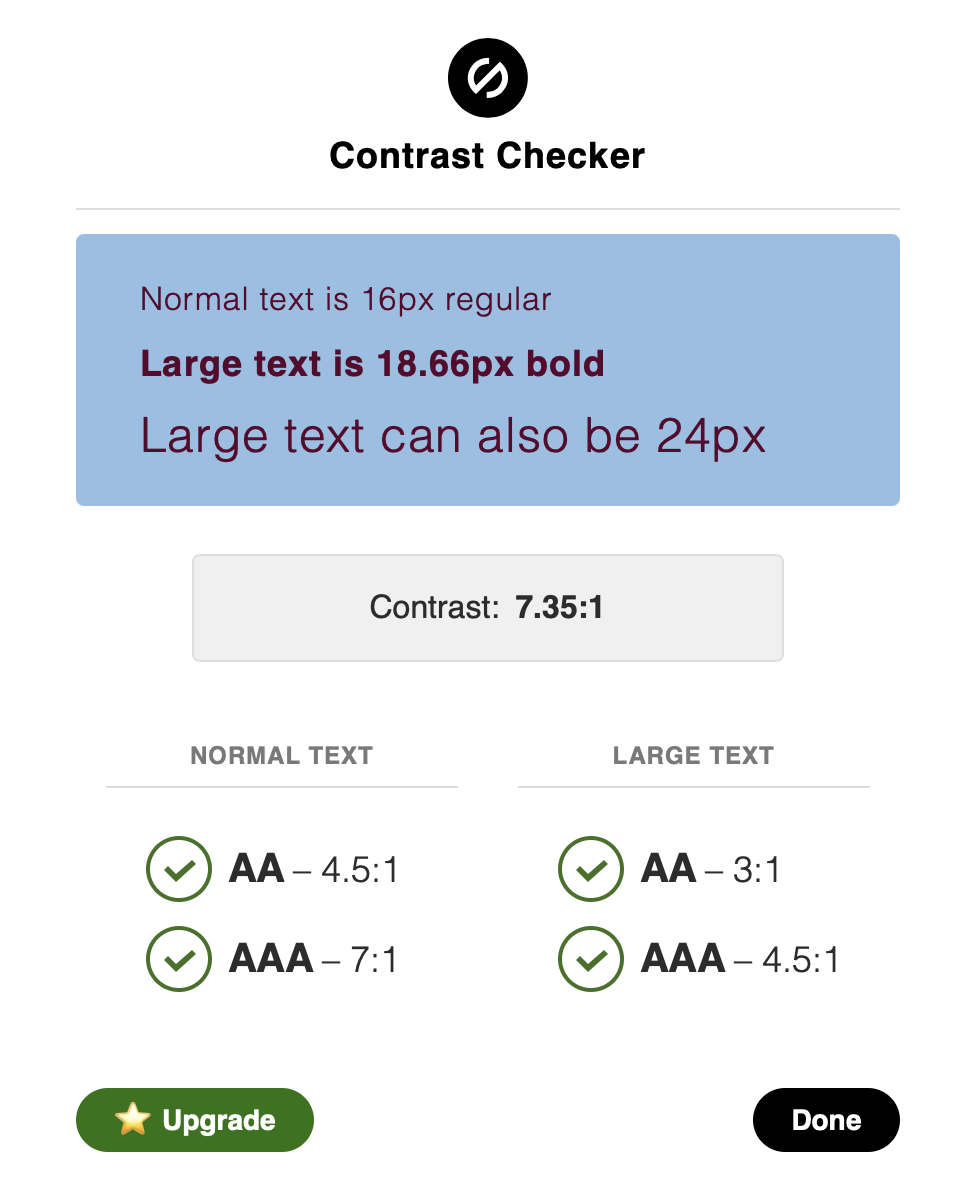
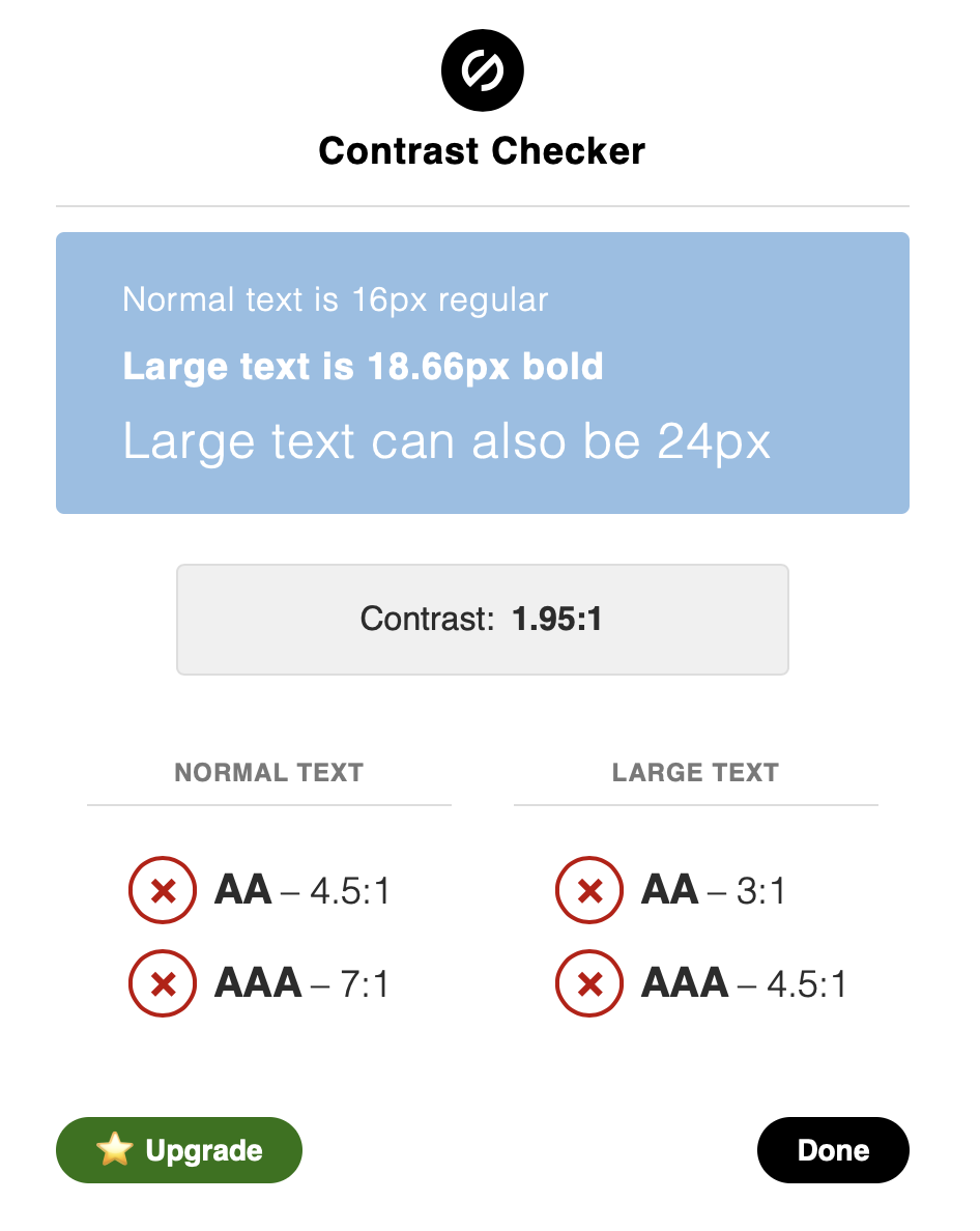
Baked right into the software you love to use, Stark empowers you to design with accessibility in mind from the conception of the brand to the fruition of the product. Stark offers tools to do things such as:
• Colour contrast checker
• Colour-blind simulation
• Colour combination suggestions of WCAG compliant swatches
Good colour contrast Bad colour contrast


Maze
Maze is a user testing platform that turns your prototype into actionable insights from real users, bringing confidence to the design process. Used by the likes of Uber, IBM, Microsoft, and Amazon, it’s a top tool to ensure your designs are working and communicating as they should be. You set your users ‘missions’ and they then use your prototype to complete these missions. From there you have instant feedback on where your prototype is being successful, but more importantly, unsuccessful.
Once you know your designs are WCAG compliant, it’s the little touches that make an experience open to all. Things such as using alt text on images, supporting keyboard navigation and using speech recognition integration tools like Annyang - a tiny javascript library that lets your visitors control your site with voice commands, can all make your designs more user friendly and accessible.
Are there any guides we can follow during the design process to create a more accessible digital experience?
Put yourself in your user’s shoes (all of your users) - carry out user testing on a diverse group. Don’t carry out six user tests internally all with a group of people who fit a similar description. If you do this, you might as well just test on one person. You have to try and test as widely as possible to get a true reflection of any accessibility issues that you as a designer may not even consider potential problems.
Support keyboard navigation - this is actually law now in the UK, so if you’re not doing this, you could receive a hefty fine. If you’re unsure what this means, imagine I instruct you to throw your mouse out of the window, and then use your company website. Can you easily navigate through the site and access the important content? If not, you’re not being accessible! Many users with motor disabilities rely on a keyboard. Blind users also typically use a keyboard for navigation. Some people have tremors which don't allow for fine muscle control (such as using a computer mouse or trackpad). A keyboard user typically uses the Tab key to navigate through interactive elements on a web page - links, buttons, fields, for inputting text, etc. When an item has keyboard "focus", it can be activated or manipulated with the keyboard. A sighted keyboard user must be provided with a visual indicator of the element that currently has keyboard focus. A basic focus indicator is provided automatically by the web browser and is typically shown as a border (called an outline) around the focused element. However, these outlines can be hidden by applying outline:0 or outline:none CSS to focusable elements.
If you ever get a bit lost, be sure to visit ‘Web Content Accessibility Guidelines’ to help you be absolutely clear about what is inclusive and what is not.
Just remember, accessible design is good design. Everything we build should be as inclusive, legible and readable as possible. If we have to sacrifice elegance - so be it.


